Print is not dead
Do you ever feel like an inanimate object has read your mind? 'Why hello Mr Tank, aren't you looking sultry there... basking in the hot sun on my balcony.' If you've ever been unfortunate enough to get into a conversation with me about magazines then you will know already that Tank is my favourite.
Do you ever feel like an inanimate object has read your mind?
'Why helloMr Tank, aren't you looking sultry there... basking in the hot sun on my balcony.' If you've ever been unfortunate enough to get into a conversation with me about magazines then you will know already that Tank is my favourite. Whenever I go to London it is at the top of my list of things to buy before coming home (next to Percy Pigs, obviously). Without fail I always leave it to the last-minute and get lurched into a state of panic at 10pm the night before my flight because, 'No, I won't be able to get it at the airport - WHSmith NEVER have it!!' Hah - always the calm and collected one. Thankfully, on the night I last left London I stepped out of a taxi onto the doorstep of Monocle and there, gleaming before my very eyes, were 30+ copies of Tank sitting in perfect rows across the outside of the shop. Chi-chiiing. Tank fix sorted.
More often than not, when I squeal about how much I love Tank there is a person across from me, distorting their face and trying to back away, saying, 'I've never read it.' This is something I find shocking and disturbing. 'What do you mean, why you haven't read it?!' I ask them with squinted eyes. 'Dunno, I'd rather waste my money on glossy weeklies that I can skim in 20min and then throw away.' Just kidding. That's not what they say.
Enough of this chitter-chatter. Let's open the pages and see why Tank is so freaking awesome...
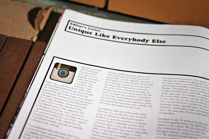
The editor's letter: on Instagram, nostalgia and the individual. Masoud Golsorkhi paints a philosophically coherent and hilarious account of how the ability to filter our lives in faux-originality is, in fact, making us ever more isolated and generic. Perfectly timed, I read this piece just a few days after posting about my love-hate relationship with Instagram.
Structure: Tank clearly credits the people (be it photographers, stylists or writers) that make the magazine come to life. This might seem straightforward but it's shocking how many publications there are that keep these points in the dark. Give credit where credit is due, I like to say.
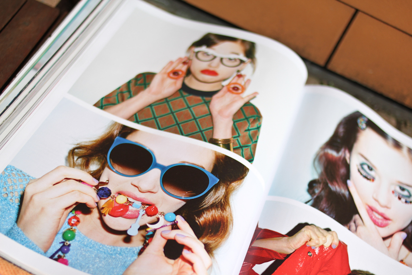
The fashion: it's good. It's so good that when I flip through the pages I feel a bit confused - 'why are all my favorite things in here?' I keep wondering. It's everything I loved most about the season (see YSL shoes above and the Prada embellished jacket meets slouchy knit combo) plus a smorgasbord of brands/designers I've never heard of. I like that. Does this come down to the brilliance of fashion director Caroline Issa? I think so.
The words: they can be a bit tricky I'm not gonna lie. Put in a little effort though and you'll reap the reward. Think of them like a fine wine, an aged cheese, a piece of painfully sour candy or even those shoes that hurt a bit at first but then, once you've broken them in, can't live without. What I'm trying to say here is that Tank doesn't dumb it down. The writers are cutting, sarcastic and intelligent. You might need to google search a few words but, hey, that's ok. It'll leave you feeling smarter and more informed... or confused. Either way, chances are, you'll find yourself thinking back to what you read. Maybe because you agree with it or maybe because you don't. The words in most magazines leave me wanting to chew my arm off...
Okay, moving on.
The editorials: so good. They bring brands like Lacoste, Thomas Tait, Jil Sander and American Apparel together. No matter how beautiful it is, editorials that take looks straight off the runway and shoot them in an idyllic location aren't what really get me excited. I like seeing the best that fashion has to offer right now but in a new way. Emerging British talent mixed with good basics and a slathering of high-end drool-worthy pieces is my idea of perfection. For the record, I would like to go shopping with Pandora Lennard - she is a babe and nails it every time.
In short, Tank is a fashion magazine for the kind of person I want to be. It presents what is coolest and most cutting edge but with a grounded London-based perspective. Whether you're into grand ideas, photography, music or glittery ear-claws... it always has something insightful to say.
I'd feel just as confident having Tank tucked under my arm upon entering a philosophy seminar at LSE as I would walking into Somerset House in the middle of fashion week... just sayin'.
p.s. find Tank wherever good magazines are sold for £6. Can't find it in a shop? Never fear, it's all online right here.
RESURRECTING THE PEPLUM...
Oh, yes yes yes... the peplum has had its moment before. Back in the '40s and '50s Dior nipped in the waists of women in the peplum style. Famously, it came to be known as the 'New Look' - one that showed off the curves of the wearers body. So, suck in your waist ladies, bust out your boobies and flaunt what yo mama gave ya because this look is making a comeback. Err, actually, fear not, it was all still very demure.
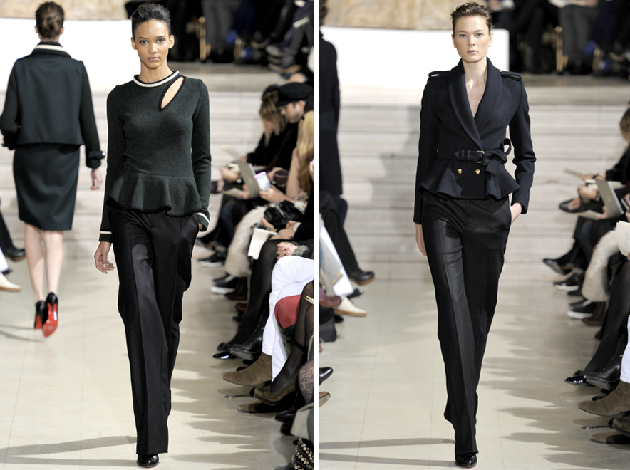
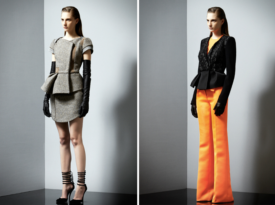
Sixty years on and the peplum has once again popped up all over the catwalk. For Spring 2012 the emphasized waist made an appearance in a whole host of collections, including Givenchy, Celine, Kenzo and McQueen. It was, undoubtedly, the silhouette de jour.
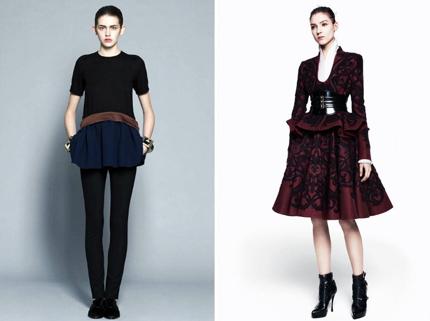
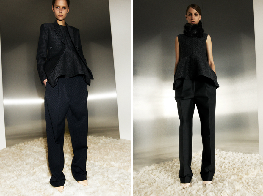
It wasn't until recently (Albino pre-fall look #12 to be exact) that I fell for the shape. Sure it's gorgeous on the catwalk in all it's elaborate charm but when it moves to the real world it gets too girly... too foofy... too laaame. But pre-fall showed that it's a shape with longevity. It's like the peplum got in a fight in a school yard and came out tougher on the other side. Make it more boyish and it's capable of working in real life. Heck, Phoebe Philo's version is so roughed up it's barely recognizable. Pair with slouchy trousers or loose shorts (summer, yes you will one day come) for a simple, wearable and (gasssp, even) flattering shape.
If you're looking for something other than pastels to get excited about for spring then this, my friends, is it...
Collections from top: Jason Wu ss12, Alexander McQueen ss12 and Givenchy ss12. Albino and McQueen - both pre-fall12. Bouchra Jarrar couture s12. Antonio Berardi and Celine pre-fall12. Photos from Style.com
THIS WEEK I LOVE...
1. Blocked denim via Cos and A Détacher. 2. Floral on floral on floral from ADAM. 3. Dreamy misty landscapes. 4. Washed out pink denim from MiH. 5. Acne accessories: the turquoise Alice shoe and clear frames. 6. Miu Miu gingham earrings. 7. Topshop's clear plastic purse. 8. Sandro.
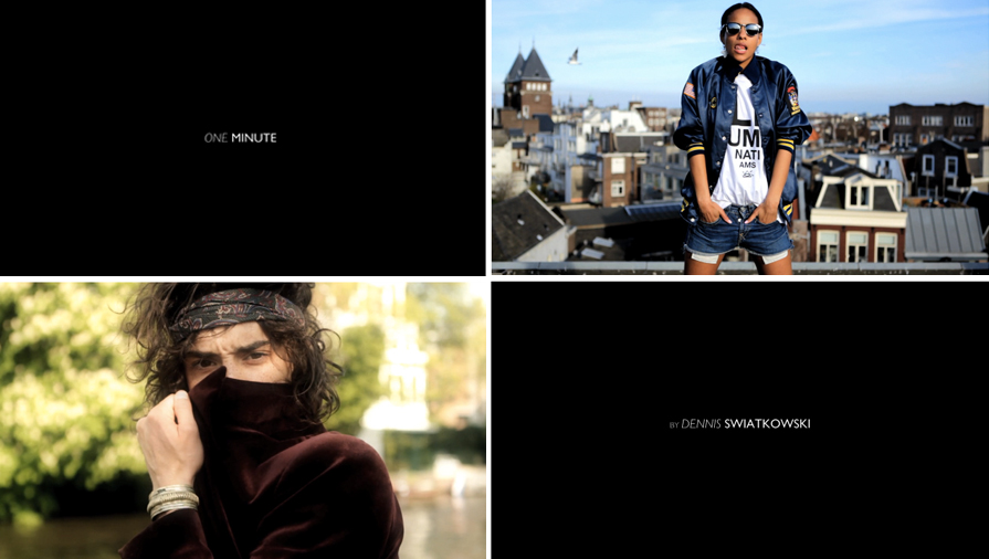
9. One Minute by Dennis Swiatkowski - from the blog Get Your Plane Right On Time comes the incredibly succinct and effective video portrait. It's like street style but on a whole new level. The music is chilling and the characters are perfectly portrayed. Hop over and start watching.
Hope you're having a wonderful week. xx
Palmer//Harding
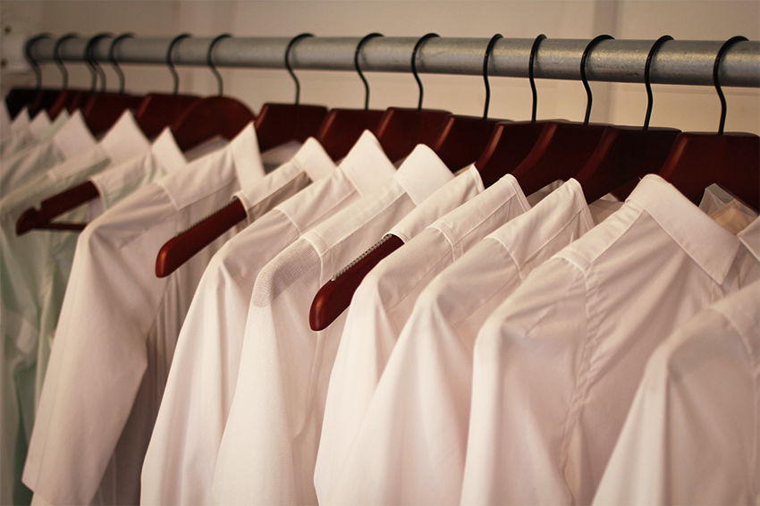
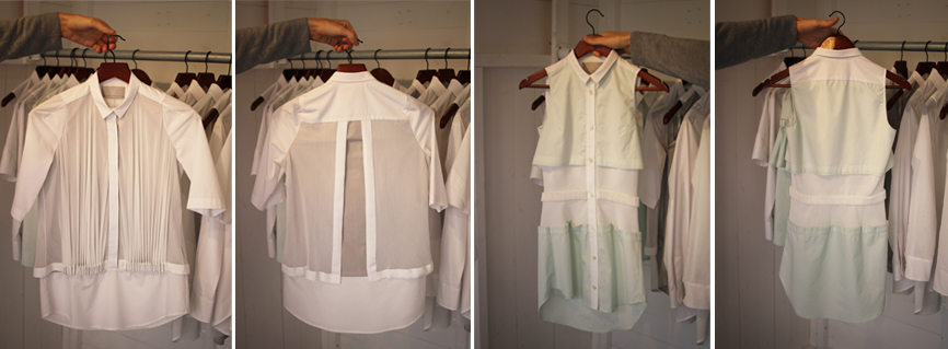
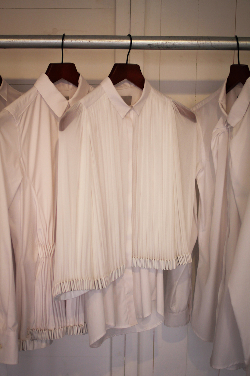
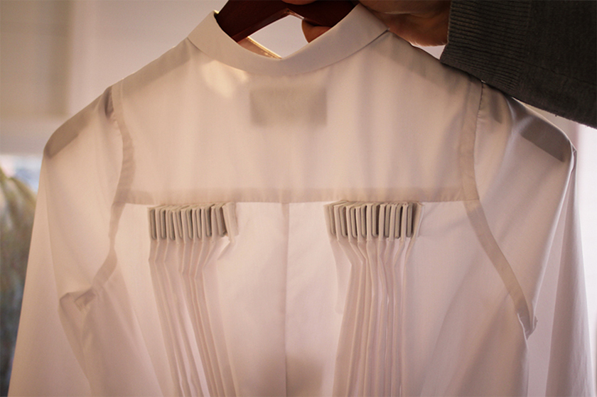
I first came across Levi Palmer and Matthew Harding in the NewGen tent at London Fashion Week. They were just two guys hanging out in a small space surrounded by white shirts. On a single rail they hung in perfect formation. Though at first glance the shirts looked deceivingly regular, on closer inspection it's clear they are anything but ordinary...
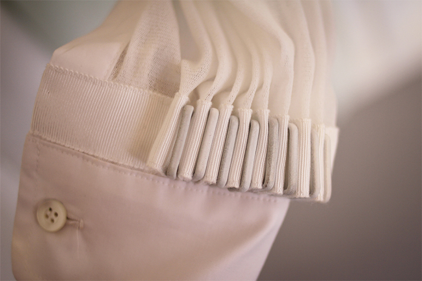
It must have been the simplicity and crispness that drew me in. The predominately white colour palette evokes a sort of medical cleanliness not unfamiliar to what was found in Jil Sander's recent collection. The austerity though of the traditional white shirt is dismantled by the intense focus on detail. The way the fabric is gathered and pinched reminds me of rippling sand dunes. There's a softness and a feeling that the garment is almost in motion. The rubber coated brass findings, shown above, add an unexpected weight and heaviness to the shirts - a truly unique feature.
Instead of creating a collection for the sake of show (see Matthew's CSM MA collection for an example of earlier work - it's stunning) the designers intention is to focus on something that will easily fit into peoples wardrobes. There is nothing I love more than a basic item that has been reworked into something truly covetable - Palmer//Harding shirts are just that.
Prada vs Jeremy Scott
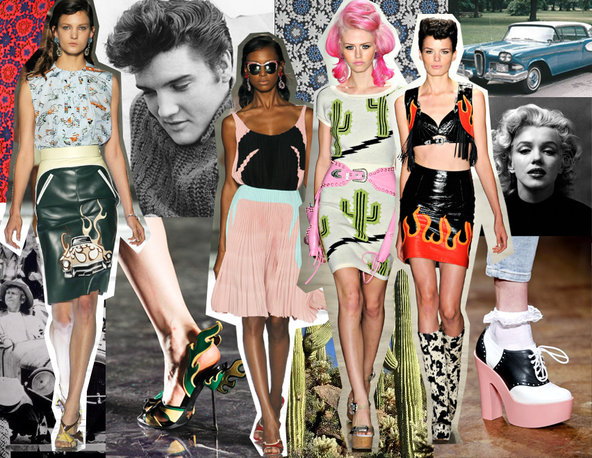
It's Thanksgiving, I know - I ought to be snuggled up in a wooly jumper making an apple pie and planning my Christmas shopping list. But instead I'm sitting here dreaming about spring and patching together a collage consisting of the Beverly Hillbillies and cacti. Random how these things happen. I don't even care though (soon I'll swap into holiday mode and bake my turkey etc etc ec).
I can't help but feel quite captivated by the classic 1950s imagery that inspired these collections. Elvis Presley, Marilyn Monroe and Thunderbirds for Prada. Flames, Santa Fe and Elly May Clampett for Scott. It's a sort-of nod to all things Americana, in an exaggerated surreal form. Currently at the top of my ss12 wish list are those platformed saddle shoes by Jeremy Scott and the Prada sunglasses that Anna Dello Russo has already been strutting around in (swooon).
Images: fashion via style.com, cactus, hillbillies, Elvis, Marilyn.
