a disappointment?
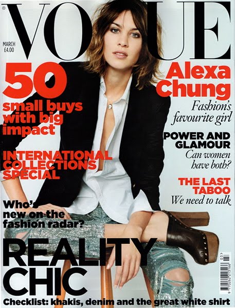
british vogue march 2010 is a little weak. i was expecting something grand, to be blown away... one of my favourite girls is on the cover after all, spring is just around the corner, fashion week is almost here... i mean seriously there is plenty to work with here. but it all just felt a little meh... you know, standard, dull, uninspiring. take the cover for example, it's alexa, she is gorgeous, we all love her... she's had the most fabulous mulberry bag named after her for crying out loud, the girl is a legend. the jeans are awesome, she's got the statement chanel clogs on, a pretty rad skull necklace... but her hair and makeup looks drab and she is sitting on wooden stool looking like she is ready for the whole ordeal to be over with already. trust me, i love alexa, and i love vogue... and i want to give the magazine the benefit of the doubt, but the more i look at that cover the more i feel like they should have worked a little harder for it. actually, i only felt this way after i read the inside of the magazine and was sorely disappointed.
ok, lets start with the highlights.

'in vogue' (page 97): a look at the new raw materials being used on the spring 2010 runways. this is interesting and something i hadn't thought of before. the article is insightful and unique. so two thumbs up on that one. plus this calvin klein dress shown in the magazine is utterly delicious. not a standout piece from their runway show but when presented in this light (with a focus on thew new materials and casual wrinkled vibe) is actually pretty sweet and spot on the trend. i love the colour and the soft shape with the loose neckline and longish sleeves. plus, is that a pocket flopping open on the left side? adorable. i am all over that dress.
then there are some 'new talents' shown... none of which i was over the moon with. for example, david koma. you know, that dress that cheryl cole wore on the x-factor and simon commented that he could see straight into it. his designs are pretty inspiring but hardly budding news.

but then they point out maia norman's debut clothing line 'mother of pearl' - it is pretty intoxicating. each piece resembles a work of art and really is quite beautiful (page 113).
the 'more dash than cash' (page 216-221) section was quite good. you can see the whole spread online though here. they have got some sweet recommendations for things to buy that are reasonably priced. like these urban outfitters sunglasses. but again... this isn't the first time i've seen these. one of my friends was wearing a similar pair back in april 2009 so a little behind here. but nothing offensive and a decent editorial.

the 'small buys big impact' section (page 233-238) was also alright. although #44 out of 50 was a hideous leather river island driving cap which was less than impressive.... and i will be seriously sore if this inspires people to start wearing them because really why would you want to look like you drive a limo if you don't? oh lordy... turns out victoria beckham has already been spotted in one.
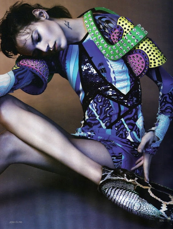
the whole 'china white' photo spread was also pretty beautiful and the 'boot camp' section was also alright... although most of the photos show a girl in combat boots and thermal underwear... hardly inspirational. i did also love the 'girls allowed' and 'cyber tribe' spreads. okay okay... so i guess i didn't hate it all.

low points:
'spy: who wears what and how' (page 139-142): what looks like an exaggerated depiction contrasting what girls wear who party at home versus those who go out to night clubs - i.e. pretty girls with lots of blush, florals, and what looks like their boyfriend's oversized sweatshirts versus leather clad vixens. a little try hard and resembles something that should have been placed in a weekly glossy.
'on a roll' (page 177) a look at wall paper (yawnnn); 'the hamptons' (page 194) a look at the location used in the january issue... why are you telling us about the january issue in the march issue? that was two months ago?!
'poo: the last taboo' (page 197) - three pages of full text on poo being the last taboo?! seriously? is this a joke. last month another uk magazine had 'abortion: the last taboo' and last year channel 4 did a whole week on 'race: the last taboo'. come on vogue. why are you trailing behind what so many others have already done? we have all heard about poo clinics and spas that charge extortionate amounts to help you poo better and to extract it all out of you.... this is lame, boring, and has already been done before. shame on you.
i suppose i was predominately disappointed by a few articles and the alexa chung spread/cover in general. i don't buy fashion magazines that often these days though, so when i do i want to be blown away. i've got hundreds of pages to read a week already for my masters so fashion magazines are a treat... i don't want to feel like they are just presenting old news or half hearted efforts.
what do you think? am i being too hard on vogue or do you sometimes feel let down by fashion magazines?
